The Microsoft Accessibility Checker
The accessibility checker tool within Microsoft’s Outlook, Word, Excel and PowerPoint enables you to easily check for any accessibility issues of the content you create within these applications.
Check you PowerPoint presentations for potential access issues
When creating any learning resources within PowerPoint it is essential to ensure that the information contain within it can be accessed by all your students. The following gives an overview of how running the accessibility checker in PowerPoint can help you provide more accessible resources before you upload to Blackboard.
Once you have completed a presentation you can run the accessibility checker to ensure the information is readable to everyone. To do this currently within the PowerPoint desktop application:
1.Click on File and Info click on the Check for Issues button.
2.To begin select the Check Accessibility option.
(Alternatively go to Tell me what you want to do… and type Accessibility Checker).
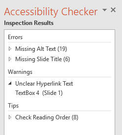
The presentation will now be inspected for potential issues and the results shown in the right side pane.
These issues are divided by decreasing severity into three classifications: Errors, Warnings, and Tips.
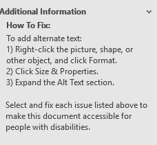
3. Click on any of the reported issues and Additional Information will be provided on how to correct these in the bottom of the pane.
The potential issues that will be flagged up for PowerPoint presentations are:
Missing alternative text on images. These short descriptions are essential if the image contains information which needs to be understood. This is especially important if the image is not explained elsewhere on the slide.
Unclear document structure. For example missing slide titles. Slide titles will be used by some to navigate through the whole presentation as it provides a main menu structure therefore each slide title needs to be unique.
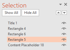
Check the reading order of diagrams (Smart Art) and bullet lists. This ensures that diagrams and objects with text have a reading order that makes sense to those who cannot view the information.
If the objects are not in the correct reading order, highlight them within the Accessibility Checker and use the arrow to re-order.
Tables should have column header information to clarify the structure of the table. Tables need to have a simple structure this necessitates not using blank cells for formatting.
Unclear hyperlink text links should have descriptive text to clarify what the link is. Full web address are normally avoided especially if they are long and non-descriptive.
General guidance on accessible presentations:
Addressing these issues before you publish presentations to the VLE should ensure that your learning resources are accessible to most students. In addition to the access concerns flagged up in the accessibility checker it is advisable to produce presentations that are readable to a wide audience. Adhering to the following recommendations from the guidelines for inclusive learning resources will help to achieve this.
When developing visual resources for presentations the following are recommended:
- Provide visual consistency with presentation style throughout.
- Avoid the use of highly detailed diagrams or charts in presentations as these will be difficult to view.
- Do not use unnecessary animation effects.
For text based content try to:
- Keep text to the essential and use text to highlight not to narrate.
- Use a font size in the region of 24-28pt.
To ensure clarity of the following should be avoided for text:
- Avoid block capitals, italicised, underlined text and highly stylised typefaces.
- Do not change text direction just for visual effect.
- It is usually unnecessary to manipulate text with Word Art and the Text Effects tools.


